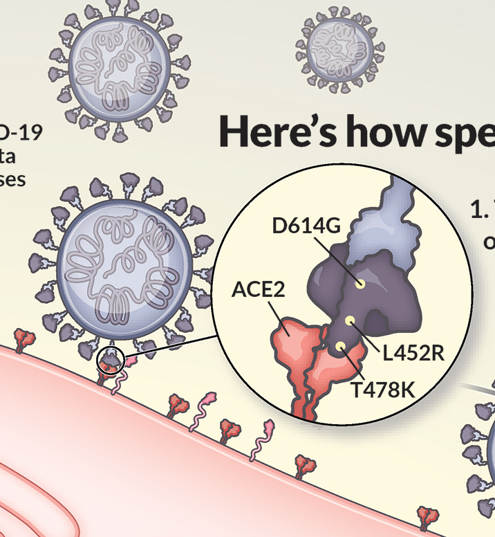
I’ve illustrated the coronavirus spike protein a lot over the last few years, including its mutations. In the process, I made many decisions about how to show mutations, and want to share my rationale.
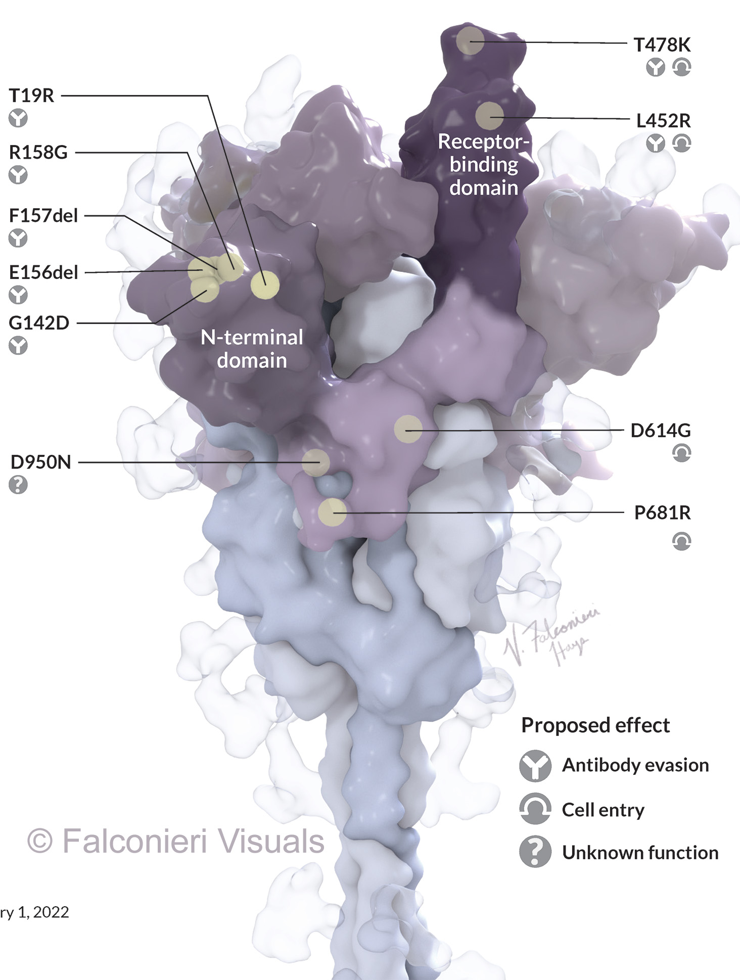
First, it’s important to review how we describe mutations – they’re identified in reference to an original, unmutated reference sequence. So, for example:
- D614G: “The amino acid at position 614 that was a D (aspartic acid) is now a G (glycine) in the mutated spike.”
- D614del would mean: “The amino acid at position 614 that was a D is now missing in the mutated spike.”
This poses a challenge – do we show the structure of the mutated spike? Or the structure of the original, un-mutated spike? For my illustrations, I chose to show the un-mutated spike. This allowed me to place markers for mutations that were deletions.
This is also consistent with how we think about mutation. We want to know – where are the changes on this variant’s spike, relative to the original virus? This was especially salient prior to the development of updated boosters, because the vaccines were all based on the original virus’ spike, and the mutations’ locations give scientists clues about how variants might evade immunity to the original spike.
If these had been very detailed illustrations for researchers, I would have used both the original and mutated structure, and shown them in comparison. However my goals were to communicate to an interested and educated lay audience – the readers of Science News & Scientific American.
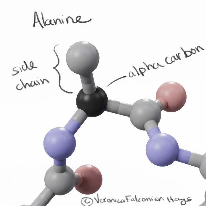
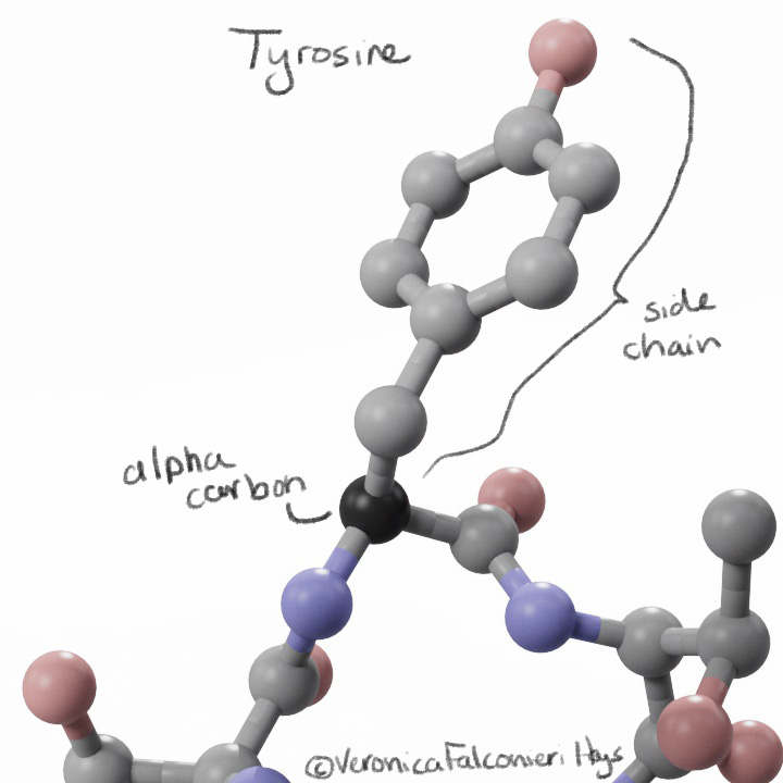
To visually mark the location of each mutation, I showed a sphere for the location of the alpha carbon. Why not show the whole side chain? Again, we run into the question – do we show the original side chain or the mutation?
Side chains may also mislead the lay viewer – a big amino acid like tyrosine would look like a “big” mutation, whereas an amino acid like alanine would look like a “small” mutation, but the size does not equate to significance.
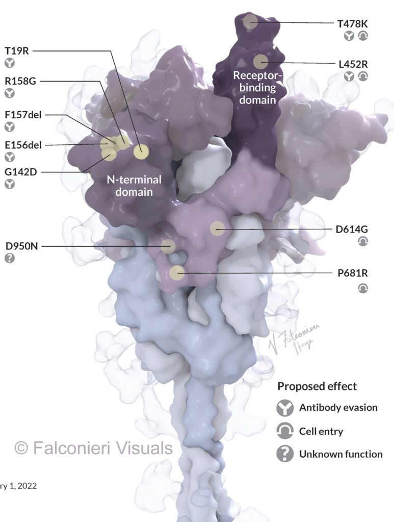
In my Science News illustration, I highlighted just one copy of the three S protein copies that make up one whole spike protein. This was because we were labeling each mutation, and annotating with their theorized functional impact. The mutations could be more easily illustrated in the accompanying 2D depiction of the viral life cycle.
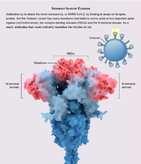
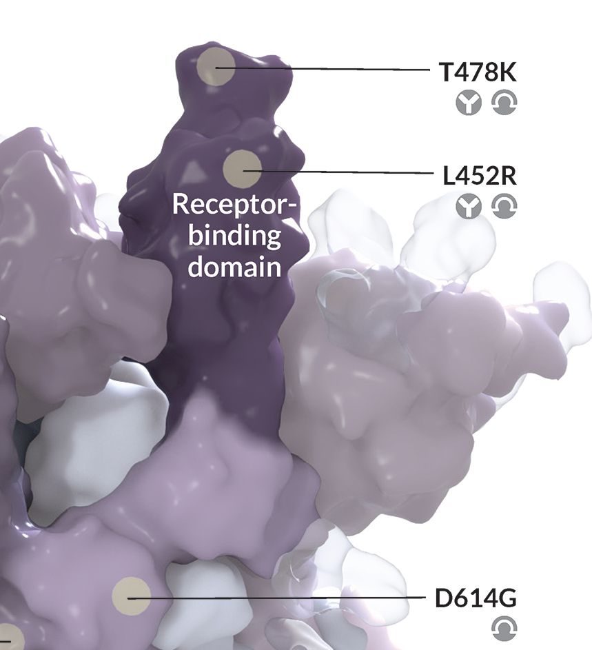
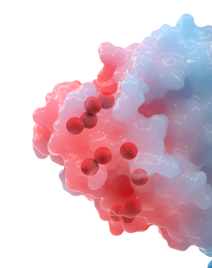
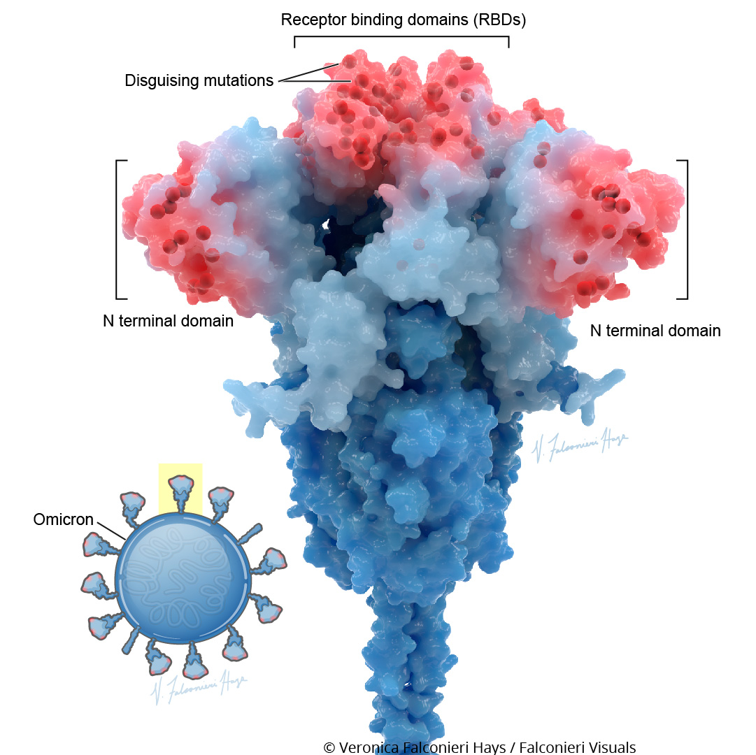
However, in the Scientific American illustration of Omicron, I highlighted the mutations in all three copies of the S protein. The graphic wasn’t going into individual detail on the mutations, just showing the striking density of mutation in the RBD and NTD regions.
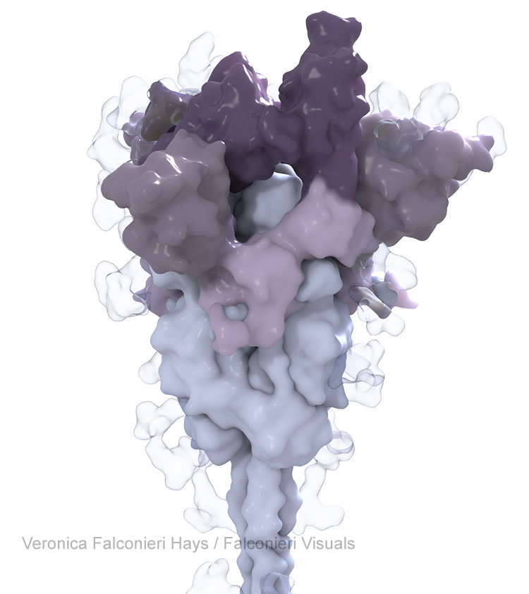
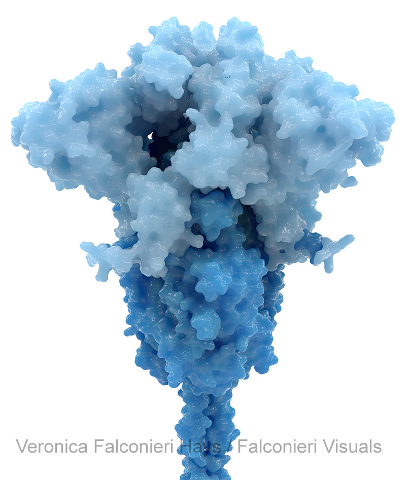
There were countless other subjective decisions made for each of these (color, conformation, surface contouring, ribbon diagram or not, glycans or not, etc.) As always, medical illustration is both a science and an art!